
SPICERS/Direct PAPER PROMO
We were invited to develop a series of six packaging promotions for Spicers and Direct Paper that heroes their range of packaging stocks.
We were briefed to create engaging promotional pieces that show the diversity of the Spicers packaging range and heroes the sustainable packaging stocks in an innovative way.
For each packaging board we created a fictitious products along with a name, brand identity, and structural solution that mindfully showcases the qualities of each stock. All embellishments and finishes were chosen with sustainability in mind.
Recognition
Best Design Awards 2024, Packaging Production Series, Structural Packaging Finalist
Best Design Awards 2024, Packaging Production Series, Design Communication Finalist
Real Media Awards 2024, Judges Choice, Contain, Dough Mates - Finalist
Real Media Awards 2024, Packaging, Dough Mates - Finalist
Real Media Awards 2023, Packaging - Mini Vits Packaging Campaign Winner
Real Media Awards 2023, Packaging Wash Pods Packaging Campaign - Finalist
Client Spicers/Direct Paper
”Mini Vits”, “Wash Pods” & “Sakini” n collaboration with Lillian Cutts
”Dough Mates” in collaboration with Megan Wilson
Printing by Adams Print
Photography by Foliolio
What we did
Packaging Design
Structural Design
Production
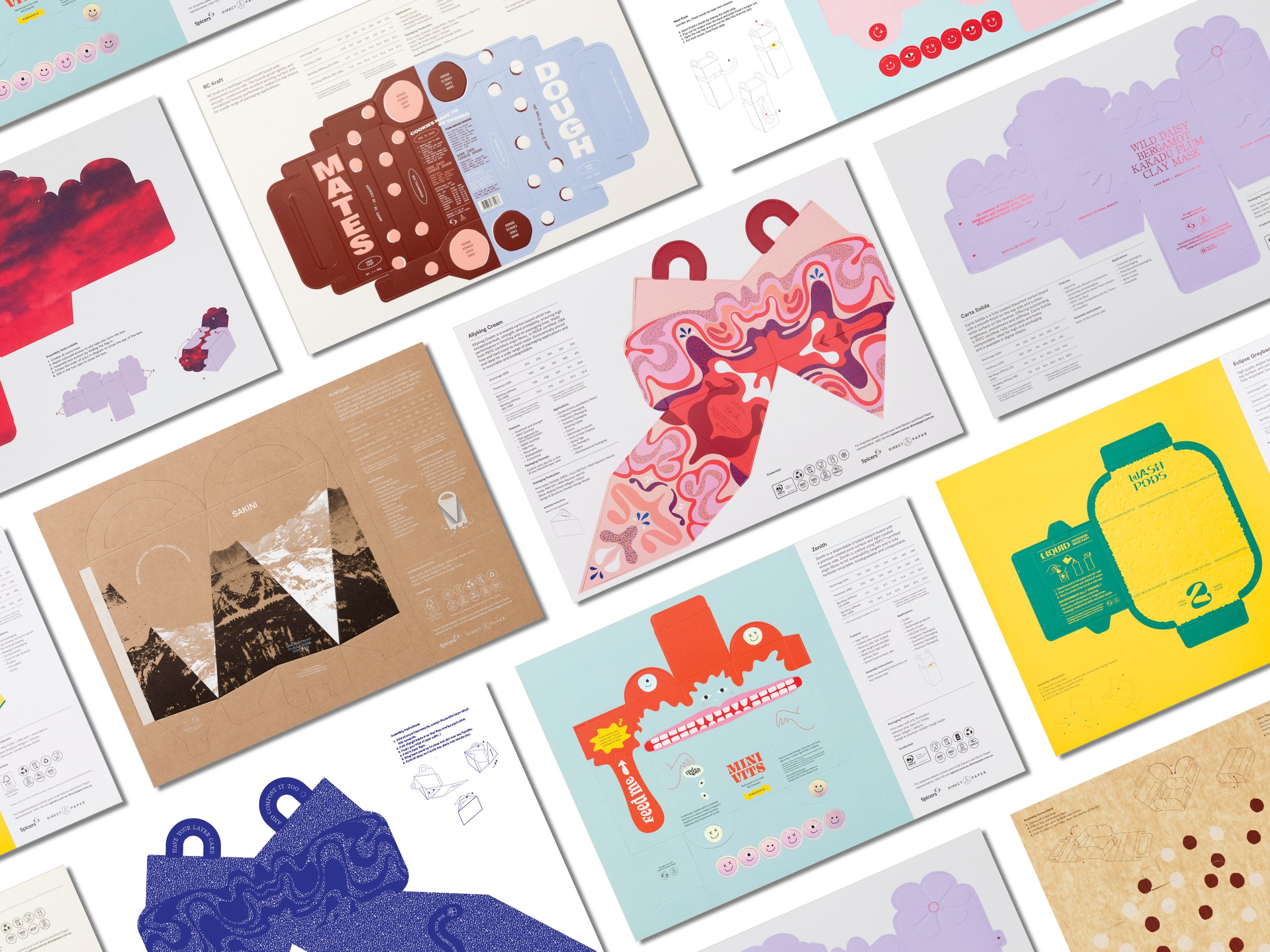
Each packaging promotion was to include a ‘pop-out’ packaging piece printed within the SRA3 sheet, to be easily assembled with clear instructions and to provide the packaging stock specifications.
The parameters were to design a packaging piece to be printed fit within an A3 sheet, including all product specifications to be assembled adhesive-free (where possible). Having the promotional pieces supplied flat allowed the sales reps to easily transport them and sent to clients and designers. The packaging piece can be popped out and assembled.


A specification template was developed for consistency and legibility across all designs, often as a perforated tearaway pamphlet.

Promotions were supplied on an SRA3 sheet, with an infographic system designed for assembly instructions.


MINI VITS
The release of the promotion within the “pharmacy” category features Zenith and created a playful solution to kid's mulit vitamins. Given the sometimes difficult ritual of daily vitamins, we created an interactive and playful outer packaging. The result is bold and playful, Frank is revealed through a tear strip and pop-up tongue within the vitamins box. Kids can feed Frank his daily holographic pop-out vitamins while also having their own.


Zenith is crafted using PEFC™ certified virgin fibres to hit sustainability targets and is fully kerbside recyclable, biodegradable and compostable.
Using Zenith we created the vitamins box which pops-out from the A3 card, the user assembles the box by folding each side and closes the box using a tuck box style closure.
A crocodile tear away strip can be removed to reveal Franks pop up tongue
Spot UV was applied to Franks hair and tongue for texture and give an unexpected elevation for this category.
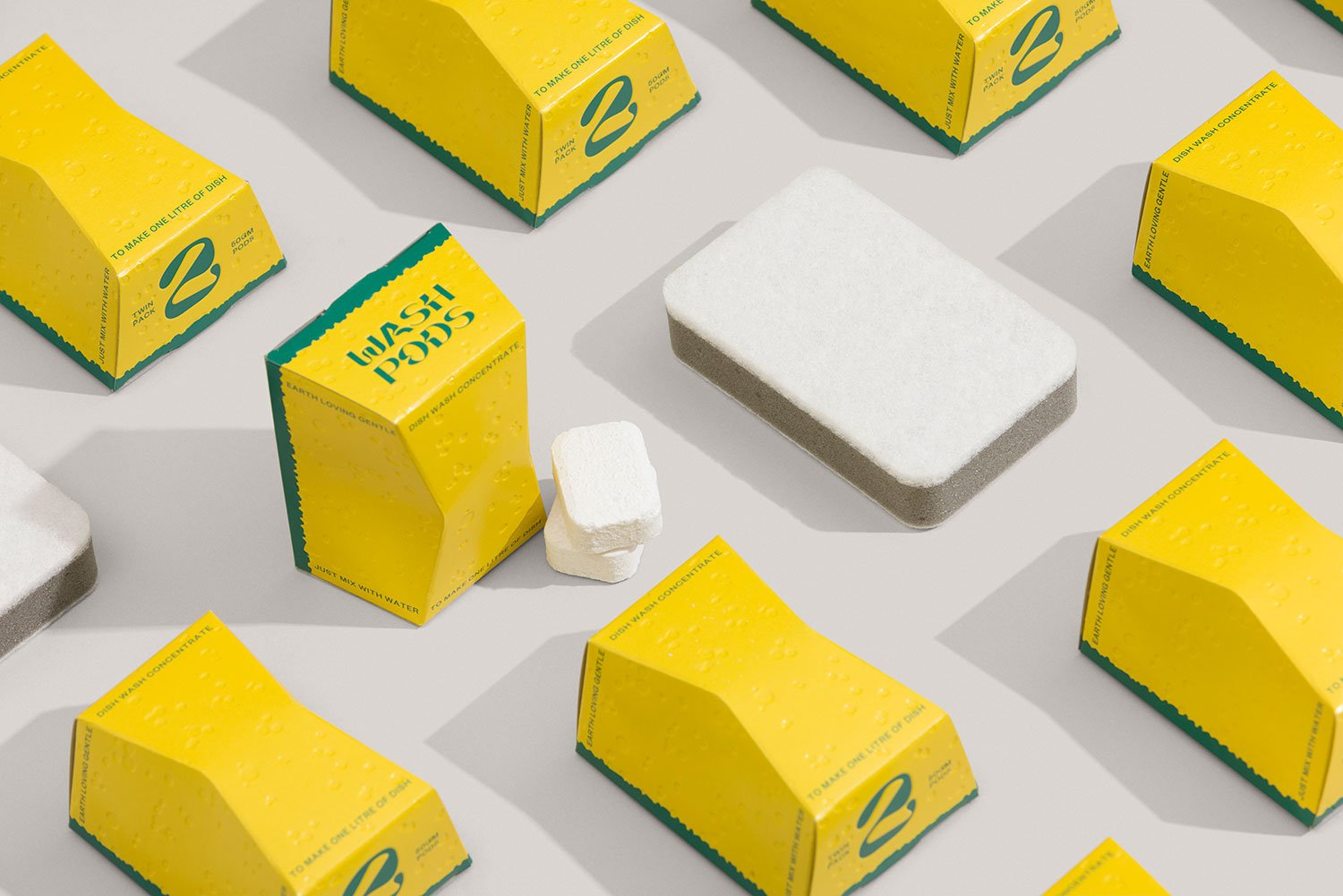
WASH PODS
Showcases a product within the “eco home” category where we featured Eclipse Greyback and created a plastic free solution to washing up. Using a paper stock made for 100% recycled fibre was the perfect pairing for this category. A tongue and cheek approach takes the everyday kitchen sponge and gives it a new life. The result is bold and modern, breaking the expected norms of a typically "green washed" looking sustainable product.


The everyday sponge was created on Eclipse Greyback card, a high quality duplex board with a smooth white clay coated top surface, and natural grey shade sealed reverse. the board is fully recyclable and biodegradable.
The design of the sponge is constructed out from a 300gsm A3 sheet, which folds into the 3D structure, utilising a tuck box closure for its final form.
To create a sponge like texture, we added a blind deboss to the sponge holes and and additionally wash pods logo.


SAKINI
Launched in Dry July, the third to be released showcases a product within the “drinks” category where we featured Kraftpak. We created an elevated solution for a non-alcoholic Saké cocktail kit with distilled water straight from the mountain. These mountain capes are reflected through the forme of the carry handle.
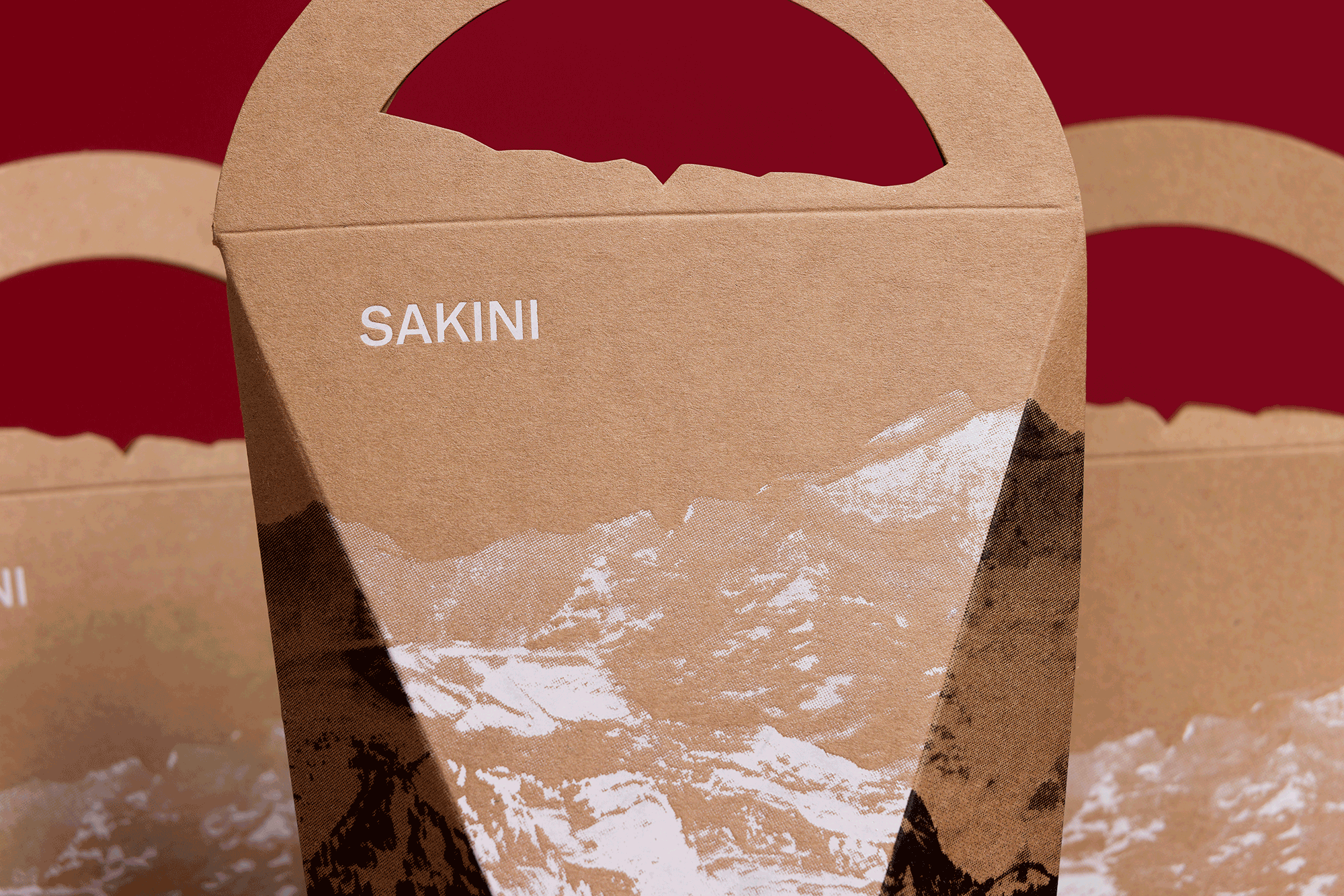
Featuring a white foil and rich black print onto Spicers Kraftpak gives the bitmapped mountainous range striking contrast on the promotional packaging design.
Printed with white foil, rich black and 3 hits of white on hit showcase how various print techniques can be used on the kraft packaging board.


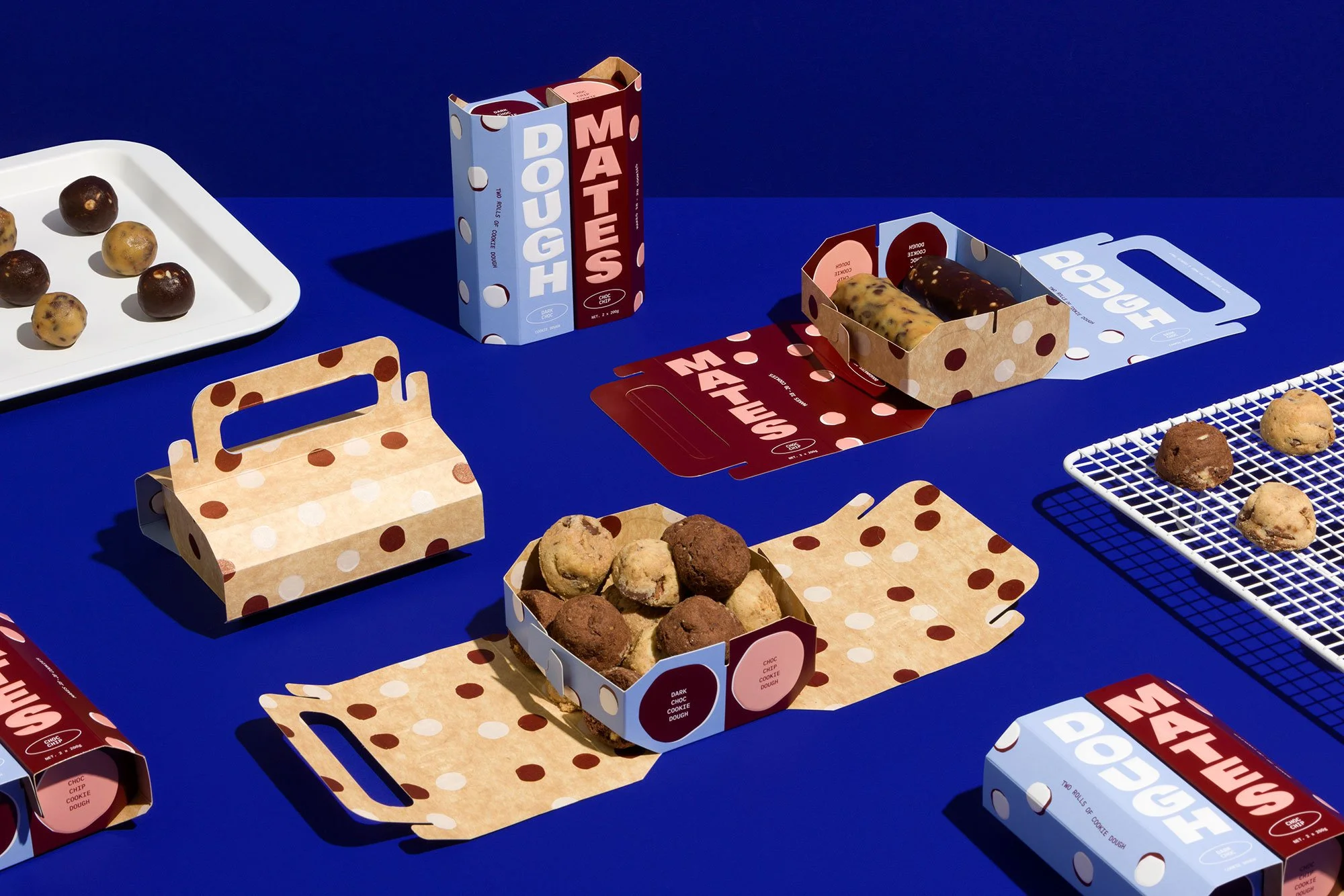
DOUGH MATES
The fourth fictitious product we had created in collaboration with Studio Wilson, a Cookie Dough product featuring two flavours which inspired the naming and packaging design - Dough Mates: Made to share. Using the RC Kraft paper we designed the packaging into a unique foldable design that turns into a cookie basket with a carry handle showcasing both sides of the paper stock. This concept was a part of the “food for fridge/freezer” category of Spicers packaging series.


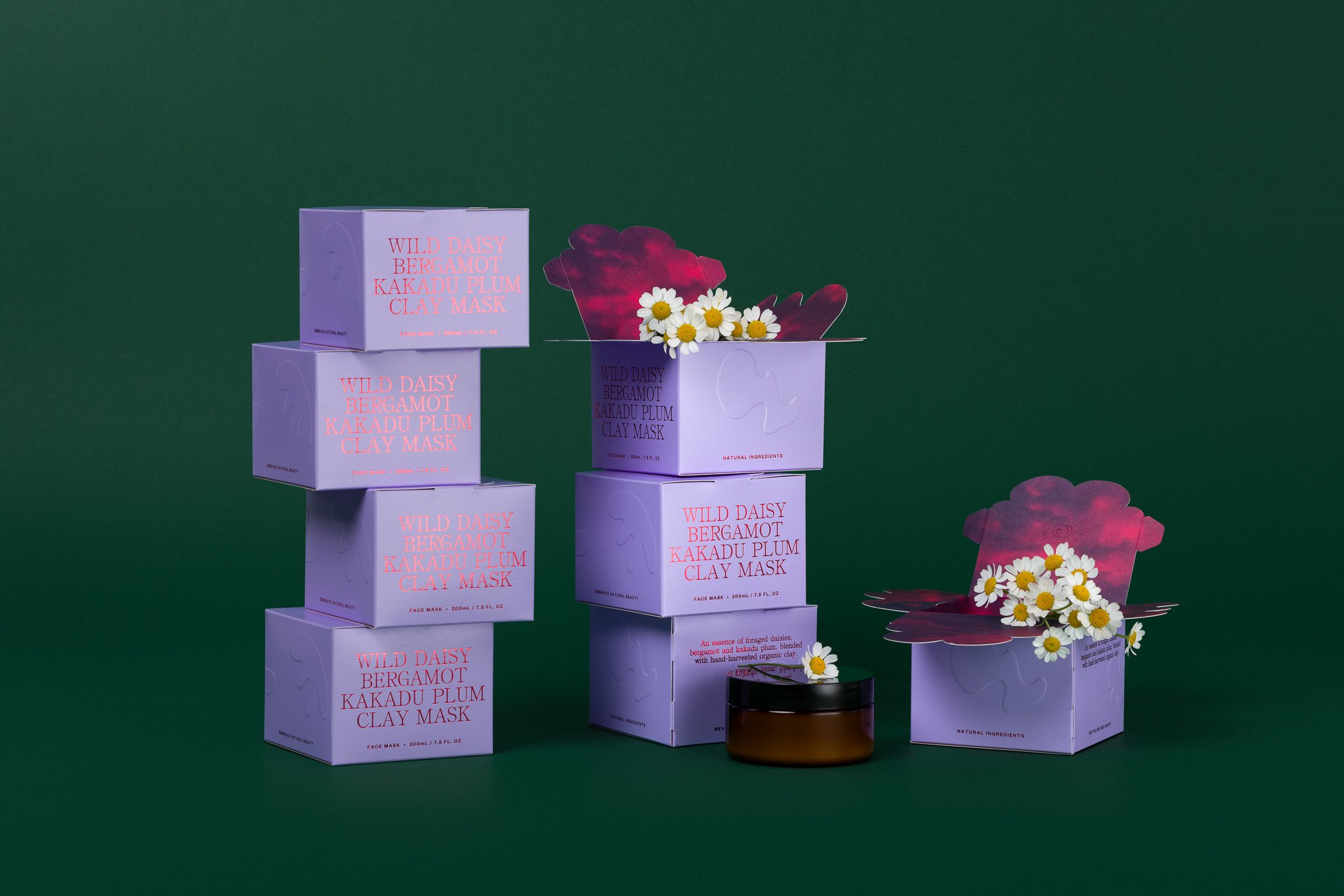


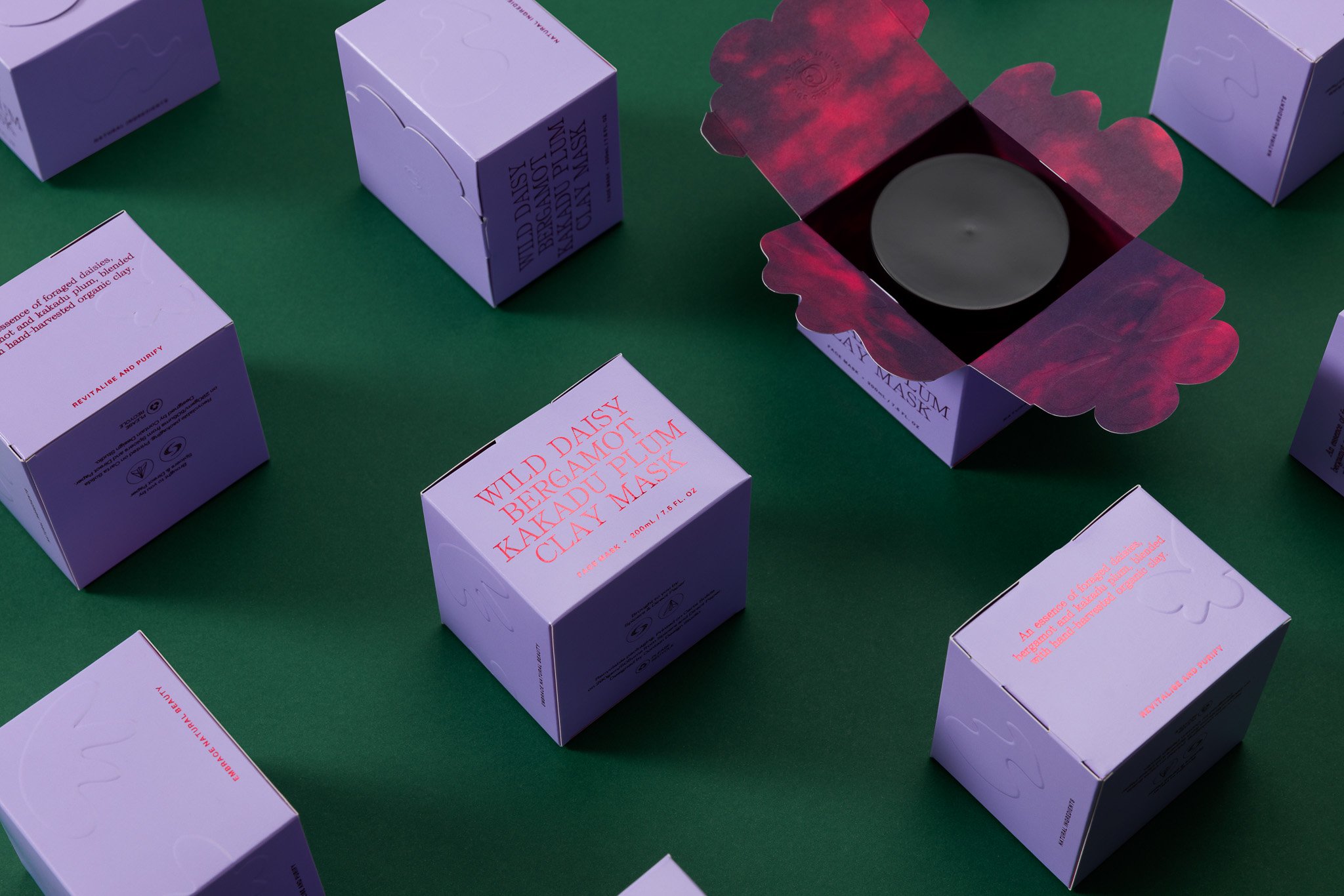
CLAY MASK
The fifth in the series to be released showcases a product within the “beauty” category where we featured Carta Solida.
The packaging is often simple and beautifully printed, but often doesnt reflect the ingredients and care gone into the actual product.
For the beauty category, our clay mask box draws design inspiration from its ingredients, featuring embossed organic floral shapes and a distinct floral lid closure.

We elevate the sensory experience of using the packaging as a storytelling device through high tactility and added theatre in the forme.
RELATED PRODUCTS & PROJECTS

Nonna's Grocer Comb Packaging
Contain Studio Packs
Wild Life Packaging

Hector's Deli Packaging